Wednesday, June 29, 2011

Color Lab #46 - Comedy of Errors!

I love this week's color combination at the Color Lab! Bravo Burgundy, Pink Pirouette, and Sahara Sand. I have had a baby card in my head ever since it was posted, and had to get it onto paper. I used my new punches (YAY!) to build the design. Gotta use the new toys as soon as they hit the doorstep, you know!


I decided to quilt the Sahara Sand background with my scoring blade. Whoops, my tool slipped. Hate it when that happens, but it was too late in the game so I used it anyway! Punched the Lace Ribbon Border in Sahara Sand and ran it thru my Xyron to get as much adhesive as possible onto the intricate cut. Too much adhesive in the design's open spaces. Could I emboss or glitter the sticky leftovers? Maybe another day. I left it in the wrapper and tried again, using 2 way glue instead. Of course I didn't think to use my vanilla Smooch spritz until after the whole thing was permanently glued together... I masked it by sticking my scratch paper under both the top and bottom edges, then sprayed on the shimmer. I think the little extra touch helps the border stand out from the same-color background.


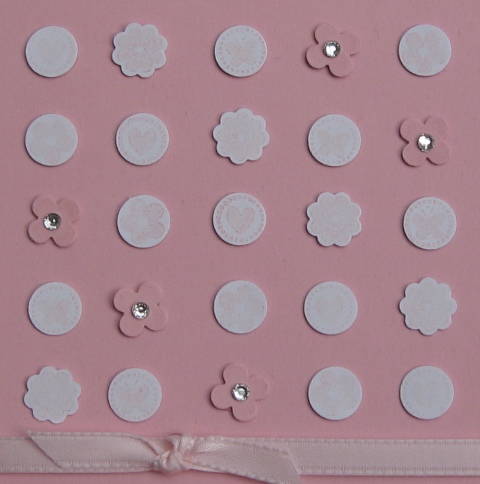
The Petite Pennants Punch (say that three times fast) banner turned out exactly the way I wanted it! I used the burgundy ink to accent the pink scalloped pennants with a little Broadsheet Accents stamp. The letters are stamped in Sahara Sand on the same color card stock with the Broadsheet Alphabet and fussy cut. The flowers are the Itty Bitty Bits, punched with the Punch Pack and blinged with pearls. The card was done! I sent a pic to my daughter to get her opinion. The baby's name is spelled LILLY! Argh! I'll give it another go later. I put a lot of energy into this, so if you know a girlie-girl named Lily who could use this as wall decor I'd be happy to convert it...


Yes, it's technically wrong. But I love it anyway! I like it as it is but I can also see it with some crochet ribbon bits, sponging, marker spritz spatters...


All supplies listed are from Stampin' Up!
Stamp Set: Broadsheet Alphabet, Broadsheet Accents, Itty Bitty Bits
Cardstock: Baroque Burgundy (retired - gotta get the new shade!), Pink Pirouette, Sahara Sand
Ink: Baroque Burgundy, Pink Pirouette, Sahara Sand
Punches: Lace Ribbon Border Punch, Petite Pennants Builder Punch, Itty Bitty Punch Pack
Adhesives: 2-Way Glue, Glue Dots
Other: Vanilla Smooch Spritz, paper cutter with scoring blade, paper snips

Saturday, June 25, 2011

Baby cards!!

I have not one, not two, not three, but FOUR cousins who have had babies in the last couple of months! I have been on a baby card spree. I made 3 of a kind... sort of. Slight variations...


Count the differences. Just kidding.


I used Pretty In Pink to create this card - but I didn't have a Classic ink pad, so I used Craft ink. I REALLY didn't want to color all those Itty Bitty Bits with a marker! The craft ink wasn't nearly as deep as the classic would have been but I'm just going to go with it. A TIP - I lined up the 4 bitty stamps on a clear block and stamped them all at once, several times, before punching them out. It was slick!! On the flag, I once again used my Curly Cute Congratulations stamp. No signs of being worn out yet!


OMG this was fun but wow... it took forever to line everything up and keep the pattern going, keep the shapes from getting out of whack... it's not perfect but it's still pretty good! Every little girl needs a little bling. :)


This was the first draft. I like it but it doesn't have quite the same punch as the second version.


 ... but it does have bling!


I used the same stamps for the blue cards as I had for the pink, but I swapped the butterfly for a star. This is the second version, which I like a little better. I'll still send out the whole lot, though, I do like them all!


I gave the flag a little lift by shaping it with my bone folder - curving it on one side and then flipping it over and curving the other way to give it a wave effect. Hopefully it doesn't get smashed on its travels to New England!


I threw this one together after our Stamp-A-Stack. It's a takeoff from a design we used there, but I used new In Colors: Pool Party, Island Indigo, and Wisteria Wonder. I had rolled out my friend's Baby Tees Jumbo Wheel onto a couple of strips of white to color and trim at my leisure. We used the Dotted Scallop Ribbon punch to create the border on this 3x3 square of white stock. Just center the punch on each side. SUPER EASY! I used the Swirls & Curls Verses hostess set from the Summer Mini and beefed up the color on the butterfly with a marker. I'll be sending this one in honor of a little boy - the colors are kind of androgynous. My daughter and I have plans to make another card like this but uber-girly and pink and fluffy for her friend - sadly, she had to miss the baby shower which was held on a Friday afternoon! I realize it's summer, but some people have jobs that keep them away during the day.. she's bummed but she'll live. I digress...


My Bits got another workout so they could adorn the corners of the frame. I like it. Ilikeitalot. Yes, I do. I just got my In Colors on Thursday so I am going to have to see how well they play with my other colors!

Now, I just have to get these in the mail! 4 cards for 4 cousins. LOVE!!

Becca

Friday, June 24, 2011

Confession!

I made a mess. I have a craft room, but my stepson is living in it temporarily so I move stuff out into the living room a little at a time, and do my thing in the middle of the floor. Subsequently, my living room is frequently a disaster. Observe...


Oops. :) I've been slowly moving things back into their proper places and will start the whole process all over again! But wow. What a pit.

Thursday, June 23, 2011

Journey

I used the retiring Define Your Life set and Sail Away from the summer mini to create this fun card. I know I live in landlocked ND but I really do love coastal living! I lived on one coast or the other until I moved here when I was 20. What was I thinking??? My grandparents always had a sailboat, and now some of my aunts and uncles do, too. My dad was in the Coast Guard so water was a way of life for us!


I made my own designer paper. I'm kind of weird and anal and crazy about my paper crafts, so here I actually cut all 3 colors into strips and then adhered them to the card base. Not Quite Navy, Cherry Cobbler, and white. The white strips are laid on top of the Cherry Cobbler, but the other colors are pieced together and oversprayed with a Cherry Cobbler marker in my Color Spritzer. I also used the spritzer to douse the top section with Not Quite Navy before I inked up the sailboat.


 I used the Designer Label Punch to frame the journey sentiment. I created the mat from 2 punches of Cherry Cobbler, trimmed and offset to properly frame the white panel. A button and a little bit of twine finish it off. I'm sure I could have threaded that twine through the button with a needle, but I just wrapped a little tape around the end to make a point and snipped it off when I was done. It looked like a shoelace. :) But it worked.


I stamped the sailboat image once on the card base and once on a scrap. I colored the flag on both with my Cherry Cobbler marker. I used Bashful Blue ink and a blender pen to shade the highlights on the sail, and Crumb Cake and Early Espresso markers with the blender pen to color the boat itself. A wisp of Night of Navy marker underscores the waves. I then trimmed out the sailboat from the scrap, and bumped it up with Dimensionals. I'm weird about my dimensionals. Once the actual pieces are used up, I cut up the border. For this card, it worked great for the small, angular areas like the top of the sail and the stern of the boat, so I had good coverage with the foam pieces for uniform lift and support. (gosh that sounds like a bra... tee hee)


Once I had everything else in place, I laid Sticky Strip across the top of the Navy/Cherry panel and then ruched some Whisper White Grosgrain ribbon (also spritzed with Night of Navy marker) along the front. I let the ends hang off and trimmed them at an angle.

We used this design at our Stamp-A-Stack events this month. I altered the design a little, eliminating the button and simplifying the striped section. I think this is a great card for graduations, retirements, or other big life events. Or, to send someone off on a year-long sail...


I think it's a winner. What do you think?

Becca

Wednesday, June 22, 2011

Prom Thank-You

Our neighbor did my daughter's hair and makeup for prom last month. She really did a great job! Of course in this household nobody just gets money. Money gets wrapped up, baby! My daughter wanted to just give her a card and put the cash inside. No problem. I had her pick the color and gave her approval rights.


Our neighbor is super cute, girly and trendy. Her parents own an Aveda salon and she is currently going to school to be a hair stylist. Pink was the order of the day!


I used some patterned paper I had picked up at a scrapbook store in central MN this winter. Here, I used one side for the front and the other side as the mat. A little ghetto-cut flag with a simple sentiment and some bling punch it up. I used Basic Black as the base, and the phrase is stamped in Basic Gray. I have the apparently common affliction of "can't stamp a straight line to save my life". Maybe I'll outgrow it someday. I do have a Stamp-A-Ma-Jig but I haven't figured out how to use it without making even more of a mess! It's character, right?


On the inside, I used a section of a different patterned paper to make a little area for a sweet note. A Melon Mambo mat gives it punch, and a little heart punched from the paper used on the front rounds it out.


We don't do plain envelopes around these parts. I had left the majority of my tools at a friend's house, including my clear blocks, so I had to use what I had on hand! For the border stamp, I used a lid to a box of embellishments. In my mind, it worked well as it isn't a crisp image, mimicking the distressed pattern on the card front. In reality, it took 3 impressions to get as much of the design onto the envelope as you see here! The lid was a little less sturdy than I had thought.

Hope you enjoyed! Next up... baby cards!

Becca

Tuesday, June 21, 2011

Father's Day Cards

I made 3 cards this year, all the same idea, for my hubby, my dad, and my stepdad. Guys like Hawaiian print shirts, right?? I had left most of my good tools, glue, etc., at my friend's house in preparation for our second go-round with Stamp-A-Stack this week, so I was fairly limited with what I could do, but I think these are winners!


I was losing light fast, so when I ran an errand I stopped off at the park to take these quick shots. :) NERD, yes I am! In honor of the occasion, these are taken at a lightpole overlooking a golf course. If you look carefully you might be able to see it in the background. Or maybe not. Pay no attention to the blonde with the camera!


Above - my hubby's card. I finished it later with large punched circles displaying our greeting and signatures. If you can imagine, I also punched small flowers in Taken with Teal, Groovy Guava, and White, scribbled centers with markers, and glued them around those circles as a paper lei to complete the goofy Hawaiian theme. This one was the only one with buttons, to be mindful of the mail-ability of the other cards.


Above - my dad's card. He was actually in Hawaii for 3 weeks this winter/spring! He works really hard, though, so he deserved it.


I thought of my stepdad immediately when I grabbed this paper. The design worked nicely to mimic buttons while staying USPS-flat. Mom messaged me and told me he LOVED it. They also loved that I sent the Mother's Day cards at the same time. She said it was so much fun. :) For some reason, it's the cardmaker's curse - I can make the darn things all day long, but mail them? Too much work... Not to mention, the flag fell off of my mailbox ages ago and no one has fixed it yet... hint, hint!

The designer paper is from the retired Bali Breeze collection. Other than that, I used my ATG gun to put it all together and a small flower punch and some glue dots for the leis (not shown). I made all three cards postcard-style, so the only moving part is the shirt front with the greeting inside. I used an origami pattern I found online. I'm sure I learned this when I was a kid, but I couldn't remember exactly how to do it. Now that I know, I'll be unstoppable. Right? Right?? This was fun. I'm sure I'll be doing it again!

Becca

Wednesday, June 15, 2011

More Candle Love

OK, people. I have decided I have no clue what I am doing. Please bear with me while I bumble around and make this page something decent to look at... In the meantime, enjoy some paper cuteness.


 I wrapped a few candles for door prizes at the Stamp-A-Stack we had last night. I showed one off here, and the rest are above... I think I am in love with the Blossom Bouquet Triple Layer Punch. I didn't do a whole lot with it here, but I did layer 2 cuts for each of these cuties. I am SO SAD all the DSP is going away but another year, another variety to drool over, right? Seriously. Elegant Soiree? Sweet & Sour? I am just getting into my groove with these and they are going bye-bye. I guess I'll get over it but I have a feeling there is some hoarding that is about to happen. Just sayin'.
 
The first two candles were modeled after the Elegant Occasions Suite from the 10-11 Idea Book, on page 66. Yes, I looked it up. I love the colors and textures and I thought the theme would be great for decorating a few candles. Have a closer look...


 Happily, everything you see here is STAYING in the catalog! I used that triple layer punch, the Scalloped Oval punch, a flower from the Itty Bitty Punch Pack, Baja Breeze textured card stock (LOVE), Soft Suede card stock, Basic Pearls, and Victoria trim. The flower is Very Vanilla. Oh, and a couple of brads to hold it down in the back. Please excuse the cruddy picture placement, I have issues and I couldn't get them lined up like I wanted.


OK, seriously, I should really just give up but I CAN'T. I should be in bed, but I just CAN'T! I think I should consider therapy... oh wait, this is what I do for therapy... man am I ever in trouble. Anyway the second candle features not one but two retiring products - the Elegant Soiree DSP and the Designer Label Punch. I love the look of the antique brad, and the little bit of Early Espresso marker splashed across the flower with the Color Spritzer makes that Very Vanilla card stock look a lot less naked. I used the Scallop Trim Border Punch on a strip of Soft Suede for the base of the wrap. Vanilla Seam Binding ribbon is so fun to ruche up and adds a frilly, girly touch.


These pics seem a little off on my screen but rest assured they are the Pumpkin Pie and Rose Red of the Sweet & Sour DSP. I did some layering here and chose to hide the ends of the paper strips behind the Designer Label, punched in Rose Red. The colors are so vibrant, they really didn't need a lot of "extra stuff". Janelle won this one. ;) Hi Janelle!


I suppose I have my work cut out for me. I did add feed burner links for readers and email, so I accomplished SOMETHING webmasterish today. Is that a word? Now I have to figure out how to whip my pics into shape and into proper formation and I'll be another step ahead. Right now as Dan Pearce would say, this is SUCH a nerd blog. :) All plain and straight-out-of-the-box and in need of some serious tweaking!! It's on my list, I promise!

I have this great idea for a Father's Day card for the hubby. Hopefully I have everything here to make it, since I left the majority of my essential tools at my friend's house after the Stamp-A-Stack so they would be available for Round 2 next week!

Good night, all!
Becca

Sunday, June 12, 2011

My Signature Style and Door Prize

I decorated this candle as a door prize for a Stamp-A-Stack this week. As a challenge from Pals Paper Arts, it really does represent my signature style. I go for girly and clean. I am drawn to pink. I do a lot of other things as well but if I am defining my style, this is it.


I used a small vanilla-colored votive candle - it's less than 1.5" tall. I pulled the colors from the designer series paper - from the Occasions mini catalog. I made a Regal Rose carnation from 3 Scalloped Circle Punch shapes using a technique I learned from Julie at Paper Pleasing Ideas. The leaves are cut from Wild Wasabi with the 5 Petal Flower Punch, scored down the center and highlighted with Wild Wasabi marker. The strips are a little over 5" long and are punched with the Scallop Edge Punch. I brought it all together at the back with 3 silver brads. I did run adhesive along all the layers and also adhered them to the candle so there is less likelihood of it all falling apart!

Here are some more pictures to show it all off:


Saturday, June 4, 2011