Our neighbor did my daughter's hair and makeup for prom last month. She really did a great job! Of course in this household nobody just gets money. Money gets wrapped up, baby! My daughter wanted to just give her a card and put the cash inside. No problem. I had her pick the color and gave her approval rights.
Our neighbor is super cute, girly and trendy. Her parents own an Aveda salon and she is currently going to school to be a hair stylist. Pink was the order of the day!
I used some patterned paper I had picked up at a scrapbook store in central MN this winter. Here, I used one side for the front and the other side as the mat. A little ghetto-cut flag with a simple sentiment and some bling punch it up. I used Basic Black as the base, and the phrase is stamped in Basic Gray. I have the apparently common affliction of "can't stamp a straight line to save my life". Maybe I'll outgrow it someday. I do have a Stamp-A-Ma-Jig but I haven't figured out how to use it without making even more of a mess! It's character, right?
On the inside, I used a section of a different patterned paper to make a little area for a sweet note. A Melon Mambo mat gives it punch, and a little heart punched from the paper used on the front rounds it out.
We don't do plain envelopes around these parts. I had left the majority of my tools at a friend's house, including my clear blocks, so I had to use what I had on hand! For the border stamp, I used a lid to a box of embellishments. In my mind, it worked well as it isn't a crisp image, mimicking the distressed pattern on the card front. In reality, it took 3 impressions to get as much of the design onto the envelope as you see here! The lid was a little less sturdy than I had thought.
Hope you enjoyed! Next up... baby cards!
Becca
Wednesday, June 22, 2011
Tuesday, June 21, 2011
Father's Day Cards
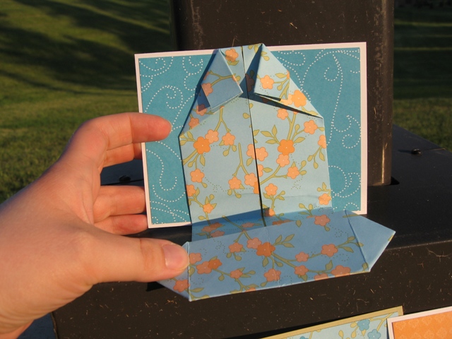
I made 3 cards this year, all the same idea, for my hubby, my dad, and my stepdad. Guys like Hawaiian print shirts, right?? I had left most of my good tools, glue, etc., at my friend's house in preparation for our second go-round with Stamp-A-Stack this week, so I was fairly limited with what I could do, but I think these are winners!
I was losing light fast, so when I ran an errand I stopped off at the park to take these quick shots. :) NERD, yes I am! In honor of the occasion, these are taken at a lightpole overlooking a golf course. If you look carefully you might be able to see it in the background. Or maybe not. Pay no attention to the blonde with the camera!
Above - my hubby's card. I finished it later with large punched circles displaying our greeting and signatures. If you can imagine, I also punched small flowers in Taken with Teal, Groovy Guava, and White, scribbled centers with markers, and glued them around those circles as a paper lei to complete the goofy Hawaiian theme. This one was the only one with buttons, to be mindful of the mail-ability of the other cards.
Above - my dad's card. He was actually in Hawaii for 3 weeks this winter/spring! He works really hard, though, so he deserved it.
I thought of my stepdad immediately when I grabbed this paper. The design worked nicely to mimic buttons while staying USPS-flat. Mom messaged me and told me he LOVED it. They also loved that I sent the Mother's Day cards at the same time. She said it was so much fun. :) For some reason, it's the cardmaker's curse - I can make the darn things all day long, but mail them? Too much work... Not to mention, the flag fell off of my mailbox ages ago and no one has fixed it yet... hint, hint!
The designer paper is from the retired Bali Breeze collection. Other than that, I used my ATG gun to put it all together and a small flower punch and some glue dots for the leis (not shown). I made all three cards postcard-style, so the only moving part is the shirt front with the greeting inside. I used an origami pattern I found online. I'm sure I learned this when I was a kid, but I couldn't remember exactly how to do it. Now that I know, I'll be unstoppable. Right? Right?? This was fun. I'm sure I'll be doing it again!
Becca
I was losing light fast, so when I ran an errand I stopped off at the park to take these quick shots. :) NERD, yes I am! In honor of the occasion, these are taken at a lightpole overlooking a golf course. If you look carefully you might be able to see it in the background. Or maybe not. Pay no attention to the blonde with the camera!
Above - my hubby's card. I finished it later with large punched circles displaying our greeting and signatures. If you can imagine, I also punched small flowers in Taken with Teal, Groovy Guava, and White, scribbled centers with markers, and glued them around those circles as a paper lei to complete the goofy Hawaiian theme. This one was the only one with buttons, to be mindful of the mail-ability of the other cards.
Above - my dad's card. He was actually in Hawaii for 3 weeks this winter/spring! He works really hard, though, so he deserved it.
I thought of my stepdad immediately when I grabbed this paper. The design worked nicely to mimic buttons while staying USPS-flat. Mom messaged me and told me he LOVED it. They also loved that I sent the Mother's Day cards at the same time. She said it was so much fun. :) For some reason, it's the cardmaker's curse - I can make the darn things all day long, but mail them? Too much work... Not to mention, the flag fell off of my mailbox ages ago and no one has fixed it yet... hint, hint!
The designer paper is from the retired Bali Breeze collection. Other than that, I used my ATG gun to put it all together and a small flower punch and some glue dots for the leis (not shown). I made all three cards postcard-style, so the only moving part is the shirt front with the greeting inside. I used an origami pattern I found online. I'm sure I learned this when I was a kid, but I couldn't remember exactly how to do it. Now that I know, I'll be unstoppable. Right? Right?? This was fun. I'm sure I'll be doing it again!
Becca
Wednesday, June 15, 2011
More Candle Love
OK, people. I have decided I have no clue what I am doing. Please bear with me while I bumble around and make this page something decent to look at... In the meantime, enjoy some paper cuteness.
I wrapped a few candles for door prizes at the Stamp-A-Stack we had last night. I showed one off here, and the rest are above... I think I am in love with the Blossom Bouquet Triple Layer Punch. I didn't do a whole lot with it here, but I did layer 2 cuts for each of these cuties. I am SO SAD all the DSP is going away but another year, another variety to drool over, right? Seriously. Elegant Soiree? Sweet & Sour? I am just getting into my groove with these and they are going bye-bye. I guess I'll get over it but I have a feeling there is some hoarding that is about to happen. Just sayin'.
The first two candles were modeled after the Elegant Occasions Suite from the 10-11 Idea Book, on page 66. Yes, I looked it up. I love the colors and textures and I thought the theme would be great for decorating a few candles. Have a closer look...

Happily, everything you see here is STAYING in the catalog! I used that triple layer punch, the Scalloped Oval punch, a flower from the Itty Bitty Punch Pack, Baja Breeze textured card stock (LOVE), Soft Suede card stock, Basic Pearls, and Victoria trim. The flower is Very Vanilla. Oh, and a couple of brads to hold it down in the back. Please excuse the cruddy picture placement, I have issues and I couldn't get them lined up like I wanted.
OK, seriously, I should really just give up but I CAN'T. I should be in bed, but I just CAN'T! I think I should consider therapy... oh wait, this is what I do for therapy... man am I ever in trouble. Anyway the second candle features not one but two retiring products - the Elegant Soiree DSP and the Designer Label Punch. I love the look of the antique brad, and the little bit of Early Espresso marker splashed across the flower with the Color Spritzer makes that Very Vanilla card stock look a lot less naked. I used the Scallop Trim Border Punch on a strip of Soft Suede for the base of the wrap. Vanilla Seam Binding ribbon is so fun to ruche up and adds a frilly, girly touch.

These pics seem a little off on my screen but rest assured they are the Pumpkin Pie and Rose Red of the Sweet & Sour DSP. I did some layering here and chose to hide the ends of the paper strips behind the Designer Label, punched in Rose Red. The colors are so vibrant, they really didn't need a lot of "extra stuff". Janelle won this one. ;) Hi Janelle!
I suppose I have my work cut out for me. I did add feed burner links for readers and email, so I accomplished SOMETHING webmasterish today. Is that a word? Now I have to figure out how to whip my pics into shape and into proper formation and I'll be another step ahead. Right now as Dan Pearce would say, this is SUCH a nerd blog. :) All plain and straight-out-of-the-box and in need of some serious tweaking!! It's on my list, I promise!
I have this great idea for a Father's Day card for the hubby. Hopefully I have everything here to make it, since I left the majority of my essential tools at my friend's house after the Stamp-A-Stack so they would be available for Round 2 next week!
Good night, all!
Becca
I wrapped a few candles for door prizes at the Stamp-A-Stack we had last night. I showed one off here, and the rest are above... I think I am in love with the Blossom Bouquet Triple Layer Punch. I didn't do a whole lot with it here, but I did layer 2 cuts for each of these cuties. I am SO SAD all the DSP is going away but another year, another variety to drool over, right? Seriously. Elegant Soiree? Sweet & Sour? I am just getting into my groove with these and they are going bye-bye. I guess I'll get over it but I have a feeling there is some hoarding that is about to happen. Just sayin'.
The first two candles were modeled after the Elegant Occasions Suite from the 10-11 Idea Book, on page 66. Yes, I looked it up. I love the colors and textures and I thought the theme would be great for decorating a few candles. Have a closer look...
Happily, everything you see here is STAYING in the catalog! I used that triple layer punch, the Scalloped Oval punch, a flower from the Itty Bitty Punch Pack, Baja Breeze textured card stock (LOVE), Soft Suede card stock, Basic Pearls, and Victoria trim. The flower is Very Vanilla. Oh, and a couple of brads to hold it down in the back. Please excuse the cruddy picture placement, I have issues and I couldn't get them lined up like I wanted.
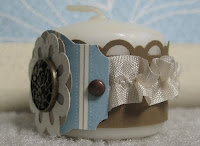
OK, seriously, I should really just give up but I CAN'T. I should be in bed, but I just CAN'T! I think I should consider therapy... oh wait, this is what I do for therapy... man am I ever in trouble. Anyway the second candle features not one but two retiring products - the Elegant Soiree DSP and the Designer Label Punch. I love the look of the antique brad, and the little bit of Early Espresso marker splashed across the flower with the Color Spritzer makes that Very Vanilla card stock look a lot less naked. I used the Scallop Trim Border Punch on a strip of Soft Suede for the base of the wrap. Vanilla Seam Binding ribbon is so fun to ruche up and adds a frilly, girly touch.
These pics seem a little off on my screen but rest assured they are the Pumpkin Pie and Rose Red of the Sweet & Sour DSP. I did some layering here and chose to hide the ends of the paper strips behind the Designer Label, punched in Rose Red. The colors are so vibrant, they really didn't need a lot of "extra stuff". Janelle won this one. ;) Hi Janelle!
I suppose I have my work cut out for me. I did add feed burner links for readers and email, so I accomplished SOMETHING webmasterish today. Is that a word? Now I have to figure out how to whip my pics into shape and into proper formation and I'll be another step ahead. Right now as Dan Pearce would say, this is SUCH a nerd blog. :) All plain and straight-out-of-the-box and in need of some serious tweaking!! It's on my list, I promise!
I have this great idea for a Father's Day card for the hubby. Hopefully I have everything here to make it, since I left the majority of my essential tools at my friend's house after the Stamp-A-Stack so they would be available for Round 2 next week!
Good night, all!
Becca
Sunday, June 12, 2011
My Signature Style and Door Prize
I decorated this candle as a door prize for a Stamp-A-Stack this week. As a challenge from Pals Paper Arts, it really does represent my signature style. I go for girly and clean. I am drawn to pink. I do a lot of other things as well but if I am defining my style, this is it.
I used a small vanilla-colored votive candle - it's less than 1.5" tall. I pulled the colors from the designer series paper - from the Occasions mini catalog. I made a Regal Rose carnation from 3 Scalloped Circle Punch shapes using a technique I learned from Julie at Paper Pleasing Ideas. The leaves are cut from Wild Wasabi with the 5 Petal Flower Punch, scored down the center and highlighted with Wild Wasabi marker. The strips are a little over 5" long and are punched with the Scallop Edge Punch. I brought it all together at the back with 3 silver brads. I did run adhesive along all the layers and also adhered them to the candle so there is less likelihood of it all falling apart!
Here are some more pictures to show it all off:
I used a small vanilla-colored votive candle - it's less than 1.5" tall. I pulled the colors from the designer series paper - from the Occasions mini catalog. I made a Regal Rose carnation from 3 Scalloped Circle Punch shapes using a technique I learned from Julie at Paper Pleasing Ideas. The leaves are cut from Wild Wasabi with the 5 Petal Flower Punch, scored down the center and highlighted with Wild Wasabi marker. The strips are a little over 5" long and are punched with the Scallop Edge Punch. I brought it all together at the back with 3 silver brads. I did run adhesive along all the layers and also adhered them to the candle so there is less likelihood of it all falling apart!
Here are some more pictures to show it all off:
Saturday, June 4, 2011
Friday, June 3, 2011
Sneak Peek - Door Prize
On Tuesday June 14th, my friends and I are putting on a Stamp A Stack! We'll make 8 full size cards, a gift card set, and a special box. Here is a sneak peek of a door prize I made... I'll post the real deal after the event.
Wednesday, June 1, 2011
Banner Time
My mom is a music nut. She has played piano since she was 9 and organ since the age of 15. She is still a church organist and also teaches lessons from home, along with various gigs accompanying high school and college musicians for recitals, etc. Her front living room is her piano studio, complete with a baby grand, an upright baby grand, and a couple of electric keyboards plus many shelves and piles stacks of music. :) I have seen a lot of banners on different blogs but Kelly Lunceford's are top notch. I followed her tutorial to make this gift for Mom's birthday, using a pennant shape rather than the notched rectangles. It now resides on a shelf in her studio.
Again, I tried a "vintage lite" look, using watermark effect stamped images and edge sponging on the pennants. The medallions are made from Newsprint DSP, edged in different colors of Stickles. I highlighted the glittery letters with distressed cardstock circles and small pre-made epoxy accents. The pennants are also topped using the Scallop Trim edge punch. I used the same colors for the flags and toppers. Originally, I had a Cameo Coral flag but I decided it was just too out of place, so I scrapped it.
Above - a closer look at the Always Artichoke "M" flag, topped with Marina Mist. I edged this one with a strip of Very Vanilla, punched with the Scallop Edge Punch. I chose the butterfly from the Nature Walk stamp set, tone-on-tone in Artichoke ink.
You can see it best in this shot - I sprayed the whole thing lightly with Silver Foil Smooch Spritz. Above, I used retired Close to Cocoa and stamped with the Elements of Style set, and finished with sponging.
I used many stamp sets, quite a few retired colors, and a lot of non-SU items for this project, so I won't detail... This was a good learning project for me. For instance, I wouldn't assemble a banner before delivering it. I had to carefully pull off some of the bows and re-staple the pennants when we got to Mom's. I definitely would not do this as a mailed gift unless the recipient had some crafting savvy to assemble it.
Again, I tried a "vintage lite" look, using watermark effect stamped images and edge sponging on the pennants. The medallions are made from Newsprint DSP, edged in different colors of Stickles. I highlighted the glittery letters with distressed cardstock circles and small pre-made epoxy accents. The pennants are also topped using the Scallop Trim edge punch. I used the same colors for the flags and toppers. Originally, I had a Cameo Coral flag but I decided it was just too out of place, so I scrapped it.
Above - a closer look at the Always Artichoke "M" flag, topped with Marina Mist. I edged this one with a strip of Very Vanilla, punched with the Scallop Edge Punch. I chose the butterfly from the Nature Walk stamp set, tone-on-tone in Artichoke ink.
You can see it best in this shot - I sprayed the whole thing lightly with Silver Foil Smooch Spritz. Above, I used retired Close to Cocoa and stamped with the Elements of Style set, and finished with sponging.
I used many stamp sets, quite a few retired colors, and a lot of non-SU items for this project, so I won't detail... This was a good learning project for me. For instance, I wouldn't assemble a banner before delivering it. I had to carefully pull off some of the bows and re-staple the pennants when we got to Mom's. I definitely would not do this as a mailed gift unless the recipient had some crafting savvy to assemble it.
Subscribe to:
Posts (Atom)