You know it's time to clean out your purse when you dig for cold medicine and find an embossing folder... Hope everyone is having a blessed Christmas season! I will share some projects soon - spent a few hours making special packaging last night, myself!
Wednesday, December 21, 2011
Monday, November 7, 2011
Babushkas
I have a confession to make. I have a ridiculous amount of Studio Flergs digital scrap supplies in my hard drive. I just love her stuff. I bought these this collection, Crafty Cutesy, the day it came out. Then I looked at it. A lot. And never did anything with it. Then it was time to go bananas making things for the craft sale at the church bazaar. So, I opened up the folder and started picking things. I made a number of notebook covers using the background papers and the cute little nesting dolls. ALL of my notebooks sold this year - I counted 4 on the tables left over from last year, and I brought a dozen more. I was happy with that, so I will continue to do this. I have made hybrid notebook covers for the last few years. It's nice to use digital supplies to get everything exactly where you want it. I used to use Photoshop to create them, but this year I used My Digital Studio to set everything up.


 Cute or what??? I dressed up the parts I had printed with Stickles, ribbon, punched shapes, baker's twine, and Tiny Tags sentiments. It was a perfect project to do while I was away from home for work, holed up in my hotel room with nothing else to do. I pumped all of these out during an episode of Law & Order SVU, in case anyone is keeping track!
Thanks for looking! Hope you get a chance to try your hand at a little digital hybrid!
Becca


Thanks for looking! Hope you get a chance to try your hand at a little digital hybrid!
Becca
Sunday, November 6, 2011
One Sheet Wonder
I followed Jessica Taylor's instructions here to make a variety of cards. I made 3 full sets of 16 cards before I knew it. I highly recommend the template and instructions. Here are some pics of sets I made. I packaged them in groups of 4 and donated them to my church bazaar, which took place yesterday.

For this set, I used a retired DSP and the new Nursery Times stamp set, plus Tiny Tags sentiments. I highlighted with Pretty in Pink and Perfect Plum solid card stock, and stamped all images in Basic Gray.
Below - Regal Rose DSP, Regal Rose and Pretty in Pink solid card stock, and Basic Grey for most of the images. I also used matching Regal Rose and Pretty in Pink markers (not sure about the green shade), along with some Dazzling Details glitter glue and shapes cut from the Beautiful Wings embosslit. Stamp sets include Pursuit of Happiness, Because I Care, and Precious Butterflies.

The next set is my favorite. I used Afterthoughts, Pursuit of Happiness, Bold Blossoms, and Bliss stamp sets. I love that retired Razzleberry Lemonade DSP and it was so much fun to use on these cards. I used Rich Razzleberry, Melon Mambo, and Crushed Curry for inking the stamps and the solid card stock. I also accented the cards with flowers punched from the Punch Pack, and the Blossom Bouquet Triple Layer Punch. I had some matching gems in my stash. I always make matching envelopes as well.


A few close-ups...


Thanks for looking! I had a lot of fun and I will definitely be using this template again.
Becca

For this set, I used a retired DSP and the new Nursery Times stamp set, plus Tiny Tags sentiments. I highlighted with Pretty in Pink and Perfect Plum solid card stock, and stamped all images in Basic Gray.
Below - Regal Rose DSP, Regal Rose and Pretty in Pink solid card stock, and Basic Grey for most of the images. I also used matching Regal Rose and Pretty in Pink markers (not sure about the green shade), along with some Dazzling Details glitter glue and shapes cut from the Beautiful Wings embosslit. Stamp sets include Pursuit of Happiness, Because I Care, and Precious Butterflies.


The next set is my favorite. I used Afterthoughts, Pursuit of Happiness, Bold Blossoms, and Bliss stamp sets. I love that retired Razzleberry Lemonade DSP and it was so much fun to use on these cards. I used Rich Razzleberry, Melon Mambo, and Crushed Curry for inking the stamps and the solid card stock. I also accented the cards with flowers punched from the Punch Pack, and the Blossom Bouquet Triple Layer Punch. I had some matching gems in my stash. I always make matching envelopes as well.


A few close-ups...


Thanks for looking! I had a lot of fun and I will definitely be using this template again.
Becca
Saturday, November 5, 2011
I am lame-o
Hey! I feel bad. It's been over 2 months since my last post. Not that I have given up crafting, far from it! I have been so overwhelmingly busy it feels like I have to schedule in time to sleep. Anyway. I'm back! Last weekend, my friends and I hosted a Stamp-A-Stack. All three of us came up with a design, and then the attendees made 4 of each. It was a blast. Here is my offering:

I love the Greeting Card Kids stamp set! We used the little girl on the pumpkin for one of last month's stamp club cards. Here, she is part of a vintage pastel Christmas vignette. The color combination was inspired by LeAnn Greff's post here. (Some days I would like to pack up and move to Minot so I could play with her all the time, she has an awesome blog full of amazing projects!) I also love the throwback look of the type in the Merry Christmas stamp from Four the Holidays. It really adds to the nostalgic feel.
Some details - base is Crumb Cake. On top of that, I layered Pool Party. I wanted it to look like a snowstorm, so I swiped my white craft ink pad over the paper until it was nice and streaky. The sentiment (and the little girl) are stamped in Early Espresso. I ran a piece of Pink Pirouette through the Big Shot with the Snow Burst embossing folder and ripped it at an angle on the top and bottom. I also sprayed it with Vanilla Smooch Spritz for a little snowy shimmer. The girl is stamped onto Whisper White and cut out with the 2-1/2" Circle Punch. The edges of the circle are sponged with Pool Party ink, and the image is colored with Pool Party, Pink Pirouette, Crumb Cake, Chocolate Chip, Pear Pizzazz, and Daffodil Delight. The tree ornaments and the buttons on the coat are dabbed with Dazzling Details glitter glue. The circle was then mounted on 2 Crumb Cake shapes cut from the Designer Label Punch, and popped up with Stampin' Dimensionals.The conservationist in me decided it was a great idea to punch these shapes from the center of my base panel! I got 3 from each, so I am saving the remnants for other projects. Genius!
Our church bazaar is tomorrow, and I've put together a large variety of card sets and covered notebooks to add to the craft sale, including a dozen of these cuties. I try to do this every year. That is part of what has kept me crazy-busy recently, added to school and work madness - this mama is so very tired. I told my husband today that even my toenails are tired! I should be able to catch up (ha ha) a little next week.
An apology for the yucky photos to come - it is North Dakota, and winter is threatening. The light is not great. Between my inability to take photos in the daylight due to this thing called a J.O.B. and the late hours I work on my crafting endeavors, the picture quality suffers - if I get pictures taken at all! At any rate, this weekend is looking like a doozy so it's off to bed for me. No supply list to follow as all items are mentioned in the post. :) Good night!!
Becca
Wednesday, August 24, 2011
Brown & Blue and slightly the same??
I made a couple of cards and when I had finished the second I sat back, looked at it, and thought, WOW I am kind of in a rut. :) Same colors, same basic layout... HELP! Well, I'd say HELP but I like the colors and they have appeared more than once already in the short life of this blog so Oh Well. It's all good.
Anyway I picked up the combination from the Elegant Soiree designer paper from last year. I don't care if it isn't "current", I like it and it's going to take me forever to use it up. Which is OK by me. Anyway this is the second card I made, another one for a new baby. Lots of babies lately after a dry spell in my circle.
 Cute as a bug! Isn't that the name of the set? Retired but I can't get rid of it. I used some markers to just barely color in the little guy and make him stand out. Another Curly Cute congratulations... I used Crumb Cake as the base and banner, and punched my circles from Crumb Cake and Soft Suede. The banner tails are curled and shredded a little with my fingernail. I used the Early Espresso striped grosgrain ribbon (retired, of course, I just can't catch a break) to add texture and interest. There's a lot of print going on with all the DSP but it's fun to add a little something more. I used halfback pearls from my stashed Pretties kit to bling it up.
Here is the first card I had made. The picture stinks but the card has been mailed, so there's no re-taking it. I can re-MAKE the card but what fun is that.
 I used Soft Suede textured card stock for the base, with Creative Elements stamps for the flourish in the corners and the fussy-cut flowers. Another Curly Cute sentiment! Lots of mileage, well worth the $$ spent on that set! I used the Eyelet Border Punch to add a strip of Early Espresso under the Crumb Cake "Thinking of You" tag, which I notched with my paper snips. Simple but pretty. I think my grandmother will like it.
Here is a close-up of the elements on the card. At least this is in focus!
 Stuck in a happy rut! Off to make ANOTHER baby card, and a birthday card!
Becca
Anyway I picked up the combination from the Elegant Soiree designer paper from last year. I don't care if it isn't "current", I like it and it's going to take me forever to use it up. Which is OK by me. Anyway this is the second card I made, another one for a new baby. Lots of babies lately after a dry spell in my circle.

Here is the first card I had made. The picture stinks but the card has been mailed, so there's no re-taking it. I can re-MAKE the card but what fun is that.

Here is a close-up of the elements on the card. At least this is in focus!

Becca
Saturday, August 13, 2011
Bright Scallop Birthday
I sent this one to my grandmother in Maine. She's dealing with Alzheimer's and it is just so important to keep in touch. I loved the colors in the Sweet & Sour DSP, but I hadn't bought it yet when I made this card. I was clearly loving the layered scallop look! I still do... Anyway this was fairly quick and I consider it CAS.
 I used markers to ink up the center of the So Many Scallops birthday stamp, then punched it out with a circle punch. This was layered onto a Pumpkin Pie circle, which was layered onto a scalloped white circle that had been stamped with the same stamp in Rose Red. I had tried to color the whole stamp but the outer design looked like... well, not good. I popped this up on dimensionals. The scallops and straight pieces are cut from Pumpkin Pie, Rose Red, and white. I offset the scallops and then trimmed the sides so they were even. The white part opens upward, placed on the layered, color base. The bottom of the front is the bottom white scallop. The lower stripes are glued onto the white base. It was fun to make and I sure hope Baba enjoyed receiving it.
Becca
Supplies Used - all Stampin' Up:
Stamp: So Many Scallops (retired)
Ink and Card Stock: Pumpkin Pie, Rose Red, White
Tools: Scallop Edge Punch, Circle Punches, 1-3/4" Scallop Circle Punch, Dimensionals

Becca
Supplies Used - all Stampin' Up:
Stamp: So Many Scallops (retired)
Ink and Card Stock: Pumpkin Pie, Rose Red, White
Tools: Scallop Edge Punch, Circle Punches, 1-3/4" Scallop Circle Punch, Dimensionals
Friday, August 12, 2011
A Very Merry Un-Birthday!
My stepson's girls came to visit, and since they were here right between their birthdays and I am HORRIBLE at mailing things, we had an Un-Birthday party! Think Alice In Wonderland and the Mad Hatter. Hats for everyone, and little food. :) A blast for little girly-girls! I made them mostly-matching cards, with enough differences to each be special.
 I was cleaning up, and of course got sidetracked and pulled out some discontinued SU colors, some bright baker's twine, and a strip of 3-D stickers from a dollar bin. Plus a carnation I had made and set aside. The green was embossed with a Cuttlebug folder I had bought ages ago and never used. They're cute, right? And talk about BRIGHT.....

 Supplies used:
Retired SU card stock: Orchid Opulence, Green Galore, Pink something...
Dollar bin stickers; twine; Cuttlebug folder; Tempting Turquoise carnation.


Retired SU card stock: Orchid Opulence, Green Galore, Pink something...
Dollar bin stickers; twine; Cuttlebug folder; Tempting Turquoise carnation.
Thursday, August 11, 2011
My girl's birthday THIS year!
I showed you last year's card, here is this year's for my now 13-year-old. (Wow does time fly... I cried a little...) She is SO INTO peace signs. She has zillions, I think. I bought her some peace signs stamps out of a dollar bin so she can decorate her school binders. I had some holographic stickers sitting around that she hadn't used yet, so I took inspiration from them to make her birthday card!
 Do you know how hard it is to photograph holographic items, not to mention holographic embossing powder?? As you can probably imagine, I stamped "Peace" "Love" and "Cake" inside. :) Taking the lead from the stickers, I punched Melon Mambo and Concord Crush with the Small Heart punch and the Build a Cupcake Punch top. I stamped Crumb Cake card stock with cupcake wrappers from the Create a Cupcake set, using Melon Mambo and Concord Crush ink, then punched them out with the cupcake bottom portion of the punch. The tops were stamped with Versamark and the Cupcake stamp set, and heat embossed using some retired SU hologram embossing powder. She loved it.
I showed my other daughter's 17th birthday card here while we were on the road. I'll show her card from last year another day - I'm pretty proud of that one, too.
Happy Birthday!
Becca

I showed my other daughter's 17th birthday card here while we were on the road. I'll show her card from last year another day - I'm pretty proud of that one, too.
Happy Birthday!
Becca
Wednesday, August 10, 2011
Hello, Doily!
My mother made a doily for my grandmother many years ago. Baba gave it to me on one of my last visits as she felt I should have it. It's a pineapple pattern in variegated cream and blues. Gorgeous. I'm sure it will make its way onto the blog someday. Love it. I was SO EXCITED when I saw the Hello Doily background stamp! It is the same pattern as the one Mom made! Someday I will attempt to make a color variation using the stamp to duplicate the real one in my room... someday. :)
 In the meantime, what's wrong with purple? I think I have had purple on the brain whenever I looked at this image. Had to get it out. I hope it worked... there are so many other colors! :) I used Concord Crush ink on Wisteria Wonder card stock to stamp the doily. I was having ISSUES again so I took the creative opportunity to do a little tearing and curling. I used Concord Crush on the base, and stamped my Smarty Pants sentiment in Versamark, then clear embossed it. The upper corner was torn and curled, and a slip of Flirtatious DSP was adhered behind. I could not cut the corner right to save my life - I tried several times and finally got it. (I blame Drew Carey and the guys from Whose Line. It's all their fault.) I mounted the purples on Sahara Sand, wrapped with white grosgrain ribbon, and then adhered the bow with glue dots.
 I guess I can't be too hard on the Whose Line gang, I finally got it right.
Here's to cable TV reruns disrupting a nice evening of stamping...
Becca


Here's to cable TV reruns disrupting a nice evening of stamping...
Becca
Tuesday, August 9, 2011
My girl's birthday
I have 2 girls. Both had birthdays in July. This card was made for my then-12-year-old last summer. She keeps it on her window ledge in her "initial display" - other T items she's collected.
 I used the Baroque Motifs set, my 1-3/4" scalloped circle punch, Tempting Turquoise craft ink and card stock, black card stock, some rhinestones, and a ribbon I am still hoarding, along with a chipboard letter I picked up somewhere and butterfly punches. I inked the T with craft ink, cured it with my heat tool, and sprayed it with some glitter spray I had in my cabinet.

 I love that something little I made for my sweet girl was worthy of immortalization in her room! :)
 Becca
Becca


Monday, August 8, 2011
Daring Adventure
I looked at this set sideways for a few weeks. It was a little grungy for my taste. Then my grandfather died and something that was said at his memorial service got me thinking. Yes, life IS nothing if not a daring adventure. I am working on it. So, I bought the set and started planning some projects around the Helen Keller quote.

I used Crumb Cake ink to create the damask background on Crumb Cake card stock. Look Ma, no Stamp-a-ma-jig! That's stamping by the seat of your pants... The footprints are Concord Crush. I inked the sentiment stamp with Peach Parfait, Melon Mambo, Concord Crush, Lucky Limeade and Early Espresso markers. I fussy cut the sentiment and double mounted on Pear Pizzazz and Concord Crush card stock. My fussy cutting leaves something to be desired, especially when done in front of the Big Bang Theory at night, by lamp light. Sigh.

Still, it was the effect I wanted! Simple but colorful. I kept seeing the set used with "dirty" colors and it wasn't really doing much for me. I got some inspiration from the catalog where a sample showed bright colors instead. I am now sold. Look for more using this set!! I plan to use it to make some memorial projects for my mom featuring my grandfather as well.
Life - it's an adventure!
Becca
Sunday, August 7, 2011
Rainbows & Butterflies
I am loving all the rainbow cards I have seen in my blog surfing of late. I had to make one of my own! I had messed around with another monotone variation which I will show another day, but here I had the punches and I had the time and I wanted to make a rainbow!

This looks MEGA BRIGHT - I am not that great at using Photoshop to manipulate photos so I just used a brightness booster in my regular photo editor. Anyway. The rainbow is built as follows:
Rose Red - Double Scallop Ribbon Punch
Pumpkin Pie - Eyelet Border Punch
So Saffron - Scallop Edge Border Punch
Old Olive - Scallop Trim Border Punch
Tempting Turquoise - another scallop punch I have - I tried the double ribbon punch but too much of the opposite side showed.
Rich Razzleberry - Doily Triple Layer Punch
I also used the Beautiful Wings Embosslit to cut colorful butterflies - Melon Mambo, Pumpkin Pie, Tempting Turquoise, So Saffron, and Rose Red.
This soothed my color fix on a dreary, rainy day!! Simple!

Wishing you rainbows & butterflies today!
Becca
Saturday, August 6, 2011
One of those FOREVER projects
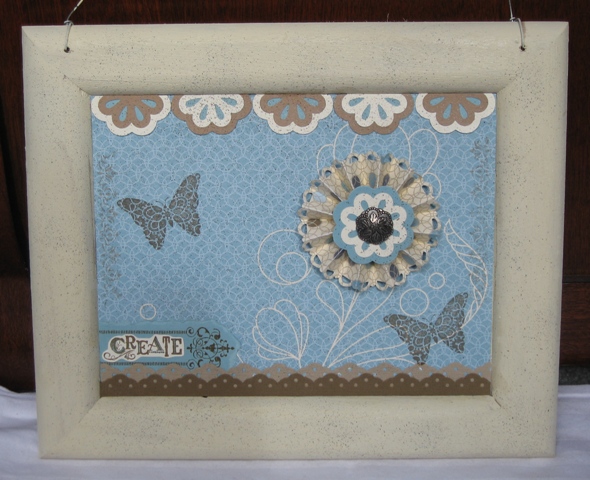
Have you ever had one of those projects that you visualized in your head, it was AMAZING, and then when you went to put it together, something went wrong and it all just stalled out? Well, this is my most recent one. I had the gorgeous background done, the top border, and a selection of cute rosettes. Some were assembled, some weren't quite done, some were glittered and beaded and... and... and... well, it wasn't finished. None of them really worked, and something was just... missing every time I went to try and finish it. That was a couple of months ago. Turns out, it was just waiting for the right stamps to come along. Here is my finally finished wall hanging.
 It's going in my craft room. I love it! I got the unfinished frame for a dollar. It was one of those things that I found for cheap in the kids' craft section, all one piece so a masterpiece could just be pasted into it. Does that make sense? So, I just put my stuff ON it, I didn't have to create the piece and stuff it into the back. This did present a small challenge as I didn't measure the opening quite right and ended up having to glue in an extra strip at the top. It doesn't bother me any more, but it really bugged me when it happened. I painted the whole frame with ivory acrylic paint and mod-podged the designer paper to it. Did you know they make SPARKLE mod podge??? It's awesome. I painted over the whole Elegant Soiree DSP panel with it. Then I used my color spritzer tool to sprinkle everything with Early Espresso and Basic Gray markers, followed by a shot of Vanilla Smooch Spritz. It was sprinkly and sparkly and beautiful. I punched out the top border using the Blossom Bouquet Triple Layer Punch, and Very Vanilla, Baja Breeze (if you can't see it, I used the full shape, filling in the backs of the flowers), and I can't really tell what that light brown is... it's been a while and it doesn't look like the current neutrals. Sigh. Once the flowers were punched, I laid them out on scrap paper and spritzed them with Early Espresso as well.
 I cut the blossoms in half and adhered them across the top. Then, I was stuck. I tried placing all the different rosettes I had made, but none of them looked quite right. Just... blah. I did assemble the center blossom with the cute Antique Brad at the same time as the border flowers. And it all sat. UNTIL TODAY. I was inspired. One of the first new sets I had marked in the new catalog was Creative Elements. Which cracked me up because I am usually grabbed first by the Elements section of the catalog, and I could instantly see a zillion projects and cards that I knew I would make once I had it in my hot little hands! So, how does that rosette look as the flower on the printed "stem"? I used the Elegant Soiree DSP, edged with the Scallop Trim Border Punch, scored between each scallop.

I borrowed the Eyelet Border Punch from a friend and punched a border from textured Soft Suede card stock. I laid it on the frame and got goosebumps - PERFECT! So I cut another border from Crumb Cake textured card stock (I love this stuff), offset and glued them together, and spritzed them with Early Espresso. A note here. I did this twice. The first time, I also sprayed the assembled border with Log Cabin Smooch Spritz. I did use scrap paper behind it, but did you know: 1. that stuff sprays a LOT, and 2. it's not exciting to clean it out of the carpet when you don't think to put the to-be-sprayed item in a box first? Such is my life. Anyway! It was perfect for the space without the Log Cabin... all for the better, I guess - for me, if not for the carpet. Don't tell my husband.
 I had already adhered the eyelet border in place when I decided butterflies were in order. And the Create corner. There's a little overlap but who's looking? Seriously, quit looking. I am so glad I thought to use the new stamp set. It works so well with this!! I had some Baja Breeze textured card stock that I just knew would be AMAZING, layered behind (of course, behind) the border with the Create legend fussy cut from Very Vanilla card stock on top. I used Soft Suede ink for all the stamping.
 I also took the finial border from the set and stamped it in Soft Suede - stamped off once before I added it to the frame, since the butterflies were full strength and it would have been too much if I hadn't. Like that run-on sentence? As you can see, I had a little ink get on the frame but that doesn't really bother me at all. I was kind of squeezing it in as this was the last element added to the piece, and I had to work around the rosette on the other side as well. It was a tight fit, but it worked. Thank goodness for acrylic blocks, since I would never have been able to make this work with a wood block stamp.
 I love it. It makes me smile. I am SO GLAD I decided to finish it. Really, I was cleaning up the mess in my living room when I came across it, and I couldn't just move it as it was. ADD, anyone? Hmmm.... So, here is the finished project once again. What do you think??
 All stamping supplies Stampin' Up:
Stamp Set: Creative Elements
Ink: Soft Suede
Markers: Early Espresso, Basic Gray, Baja Breeze
Card Stock: Baja Breeze (smooth and textured), Soft Suede textured, Crumb Cake textured, Very Vanilla, old mystery brown...
Designer Series Paper: Elegant Soiree
Punches, Tools, Etc: Blossom Bouquet Triple Layer, Eyelet Border, Scallop Trim Border, Color Spritzer, Antique Brads, cheap-o frame, acrylic paint, matte & sparkle Mod Podge
So happy to complete another UFO!! (UnFinished Object!)
Becca


I borrowed the Eyelet Border Punch from a friend and punched a border from textured Soft Suede card stock. I laid it on the frame and got goosebumps - PERFECT! So I cut another border from Crumb Cake textured card stock (I love this stuff), offset and glued them together, and spritzed them with Early Espresso. A note here. I did this twice. The first time, I also sprayed the assembled border with Log Cabin Smooch Spritz. I did use scrap paper behind it, but did you know: 1. that stuff sprays a LOT, and 2. it's not exciting to clean it out of the carpet when you don't think to put the to-be-sprayed item in a box first? Such is my life. Anyway! It was perfect for the space without the Log Cabin... all for the better, I guess - for me, if not for the carpet. Don't tell my husband.


Stamp Set: Creative Elements
Ink: Soft Suede
Markers: Early Espresso, Basic Gray, Baja Breeze
Card Stock: Baja Breeze (smooth and textured), Soft Suede textured, Crumb Cake textured, Very Vanilla, old mystery brown...
Designer Series Paper: Elegant Soiree
Punches, Tools, Etc: Blossom Bouquet Triple Layer, Eyelet Border, Scallop Trim Border, Color Spritzer, Antique Brads, cheap-o frame, acrylic paint, matte & sparkle Mod Podge
So happy to complete another UFO!! (UnFinished Object!)
Becca
One of the Good Ones
I loved the Smarty Pants sentiment set from the moment I saw it. Of course I had to buy it. I have used it a few times and this is one of my favorites.

I made this mini card for a swap. I used Basic Black, Very Vanilla, and Early Edition DSP cut into scallop strips and the DSP cut in 3 sizes of circles. The circles were lightly sponged on the edges, crumpled, and fastened together using an Antique Brad. I will say that this is my least favorite brad of the bunch but it works here. While I was sponging the circles, I also sponged the scalloped DSP for a little different effect. The scallop strips were offset and trimmed on both ends, then attached to the card. The base was punched so the inside has a scallop border as well. I used a narrow ribbon from my stash and stamped the greeting in Very Vanilla Craft Ink. Not a lot of supplies used but it's a cute, effective card for a friend.

All supplies Stampin' Up:
Stamp: Smarty Pants
Ink: StazOn Jet Black, Very Vanilla Craft
Card Stock: Basic Black, Very Vanilla
Designer Series Paper: Early Edition
Punches: Scallop Edge Border Punch, various circles
Other: Sponges, Antique Brads, ribbon
Thursday, July 14, 2011
Rainbow Birthday
This is blogging from the road... please excuse any autocorrect weirdness!
I made this card for my daughter a couple of weeks ago, knowing we would not be home on her birthday (which falls on Saturday). She's a colorful kid, and I wanted to make her a colorful card. Between that and all the rainbow inspiration out in blogland lately, this was a snap to design.
For the rainbow panel, I colored in a half sheet of watercolor paper with watercolor crayons and spritzed generously with water. I then used an aquapainter to blend the colors. It was a quick and easy process. While the panel was still wet, I sprayed it with vanilla Smooch spritz. I mounted the dry panel on a crimped piece of Pacific Point cardstock. The base is Tempting Turquoise stamped with the cupcake top from the Create a Cupcake stamp set, using white craft ink. Every time I see that shape, I think "Cloud!" The turquoise piece was then also sprayed with vanilla spritz. The sentiment is from Swirly & Curly Verses. I colored the balloons with Real Red and Pacific Point markers.
Hope she likes it! Colorful, fun, and sparkly, just like she is!
Sunday, July 3, 2011
Baby Card Do-Over
I made a card for my daughter's friend. Turns out, I should have asked how to spell her name. Sigh. The very next night, I made a new card. I had some more Baby Tees that I had wheeled out, so I asked for some colors and got to work.

Sorry for the weird color, I was chasing daylight and it was cloudy. Anyway, I used matching cardstock and markers to create this little cutie. Notice, NO NAME. I did put a Congratulations stamp inside. I colored the onesies, punched the flowers, and started gluing it all together.
I just knew when I saw the triple layer punches in the summer mini that they would be in the big catalog, too. I was right! Why put out all that energy and effort to make a punch if it isn't going to be part of the main lineup?
I love layering different colors together. I knew I wanted white flowers, so I punched bottom layers out of the colors I used in the onesies. Mostly In Colors, of course! I love the way Wisteria Wonder and Concord Crush look together.

I trimmed out and popped up the onesies on dimensionals, as well as a few of the flowers. I punched one flower out of the Pink Pirouette card stock and stuck it to the envelope with a Basic Rhinestone. We decided bling would be overkill here, much as we love it!
 All supplies Stampin' Up:
Stamp: Baby Tees Jumbo Wheel
Ink: Black (used with Jumbo Handle)
Markers and Card Stock: Blushing Bride, Wisteria Wonder, Concord Crush, Peach Parfait, Pear Pizzazz, So Saffron, Pink Pirouette. Whisper White card stock.
Punches: Blossom Bouquet Triple Layer Punch, Itty Bitty Punch Pack, Dotted Scallop Ribbon Border Punch

Sorry for the weird color, I was chasing daylight and it was cloudy. Anyway, I used matching cardstock and markers to create this little cutie. Notice, NO NAME. I did put a Congratulations stamp inside. I colored the onesies, punched the flowers, and started gluing it all together.
I just knew when I saw the triple layer punches in the summer mini that they would be in the big catalog, too. I was right! Why put out all that energy and effort to make a punch if it isn't going to be part of the main lineup?
I love layering different colors together. I knew I wanted white flowers, so I punched bottom layers out of the colors I used in the onesies. Mostly In Colors, of course! I love the way Wisteria Wonder and Concord Crush look together.

I trimmed out and popped up the onesies on dimensionals, as well as a few of the flowers. I punched one flower out of the Pink Pirouette card stock and stuck it to the envelope with a Basic Rhinestone. We decided bling would be overkill here, much as we love it!

Stamp: Baby Tees Jumbo Wheel
Ink: Black (used with Jumbo Handle)
Markers and Card Stock: Blushing Bride, Wisteria Wonder, Concord Crush, Peach Parfait, Pear Pizzazz, So Saffron, Pink Pirouette. Whisper White card stock.
Punches: Blossom Bouquet Triple Layer Punch, Itty Bitty Punch Pack, Dotted Scallop Ribbon Border Punch
Saturday, July 2, 2011
PPA100 - Clear Embossing
Happy 100 to the Pals Paper Arts challenge site! The challenge this week is to showcase a favorite technique. My favorite thing to do is clear emboss for a tone-on-tone look, paired with clean and simple card design. I put this together last night - the hardest part was coming up with the colors! My goal was to showcase the technique and leave it at that.

My 12 year old declared it a masterpiece. She said she wanted it for her birthday, then started talking about Warhol. ???!!! Hello? She's 12! (And of course she was right, that was the inspiration.) Then we had to talk about some of his more famous pieces... and the conversation deteriorated from there. We were, after all, having a Parks & Recreation marathon via Netflix. I had at one point considered using NO sentiment and just making a 4.25" square card but I just couldn't do it.
This is a standard 5.5x4.25" card. The squares are each 2x2. To ensure the colors all came out in one big square, I mounted them on a 4" piece of cardstock before putting it all down on the card front. I used markers to match the card stock to color the music notes and bird on the sentiment. I'm getting as much mileage as I can out of that hostess set before the mini ends! OH WAIT. That doesn't happen until the end of August. LOTS of time! :) I also had to use some brand new items from the 2011-12 catalog, the new In Color Calypso Coral and the Delicate Doily set - which had been on backorder and showed up on Thursday!
Anyway, hope you like it, it's definitely simple but I love the way it turned out.
All supplies Stampin Up:
Stamp Sets: Delicate Doilies, Swirls & Curls Verses
Card Stock: Whisper White, Calypso Coral, Rich Razzleberry, Old Olive, Tempting Turquoise
Ink: Versamark, StazOn Jet Black
Markers: Calypso Coral, Rich Razzleberry, Old Olive, Tempting Turquoise
Other: Clear embossing powder, XL Oval Punch
Wednesday, June 29, 2011
Color Lab #46 - Comedy of Errors!
I love this week's color combination at the Color Lab! Bravo Burgundy, Pink Pirouette, and Sahara Sand. I have had a baby card in my head ever since it was posted, and had to get it onto paper. I used my new punches (YAY!) to build the design. Gotta use the new toys as soon as they hit the doorstep, you know!

I decided to quilt the Sahara Sand background with my scoring blade. Whoops, my tool slipped. Hate it when that happens, but it was too late in the game so I used it anyway! Punched the Lace Ribbon Border in Sahara Sand and ran it thru my Xyron to get as much adhesive as possible onto the intricate cut. Too much adhesive in the design's open spaces. Could I emboss or glitter the sticky leftovers? Maybe another day. I left it in the wrapper and tried again, using 2 way glue instead. Of course I didn't think to use my vanilla Smooch spritz until after the whole thing was permanently glued together... I masked it by sticking my scratch paper under both the top and bottom edges, then sprayed on the shimmer. I think the little extra touch helps the border stand out from the same-color background.


The Petite Pennants Punch (say that three times fast) banner turned out exactly the way I wanted it! I used the burgundy ink to accent the pink scalloped pennants with a little Broadsheet Accents stamp. The letters are stamped in Sahara Sand on the same color card stock with the Broadsheet Alphabet and fussy cut. The flowers are the Itty Bitty Bits, punched with the Punch Pack and blinged with pearls. The card was done! I sent a pic to my daughter to get her opinion. The baby's name is spelled LILLY! Argh! I'll give it another go later. I put a lot of energy into this, so if you know a girlie-girl named Lily who could use this as wall decor I'd be happy to convert it...


Yes, it's technically wrong. But I love it anyway! I like it as it is but I can also see it with some crochet ribbon bits, sponging, marker spritz spatters...
Cardstock: Baroque Burgundy (retired - gotta get the new shade!), Pink Pirouette, Sahara Sand
Ink: Baroque Burgundy, Pink Pirouette, Sahara Sand
Punches: Lace Ribbon Border Punch, Petite Pennants Builder Punch, Itty Bitty Punch Pack

I decided to quilt the Sahara Sand background with my scoring blade. Whoops, my tool slipped. Hate it when that happens, but it was too late in the game so I used it anyway! Punched the Lace Ribbon Border in Sahara Sand and ran it thru my Xyron to get as much adhesive as possible onto the intricate cut. Too much adhesive in the design's open spaces. Could I emboss or glitter the sticky leftovers? Maybe another day. I left it in the wrapper and tried again, using 2 way glue instead. Of course I didn't think to use my vanilla Smooch spritz until after the whole thing was permanently glued together... I masked it by sticking my scratch paper under both the top and bottom edges, then sprayed on the shimmer. I think the little extra touch helps the border stand out from the same-color background.


The Petite Pennants Punch (say that three times fast) banner turned out exactly the way I wanted it! I used the burgundy ink to accent the pink scalloped pennants with a little Broadsheet Accents stamp. The letters are stamped in Sahara Sand on the same color card stock with the Broadsheet Alphabet and fussy cut. The flowers are the Itty Bitty Bits, punched with the Punch Pack and blinged with pearls. The card was done! I sent a pic to my daughter to get her opinion. The baby's name is spelled LILLY! Argh! I'll give it another go later. I put a lot of energy into this, so if you know a girlie-girl named Lily who could use this as wall decor I'd be happy to convert it...


Yes, it's technically wrong. But I love it anyway! I like it as it is but I can also see it with some crochet ribbon bits, sponging, marker spritz spatters...
All supplies listed are from Stampin' Up!
Stamp Set: Broadsheet Alphabet, Broadsheet Accents, Itty Bitty BitsCardstock: Baroque Burgundy (retired - gotta get the new shade!), Pink Pirouette, Sahara Sand
Ink: Baroque Burgundy, Pink Pirouette, Sahara Sand
Punches: Lace Ribbon Border Punch, Petite Pennants Builder Punch, Itty Bitty Punch Pack
Adhesives: 2-Way Glue, Glue Dots
Other: Vanilla Smooch Spritz, paper cutter with scoring blade, paper snips
Subscribe to:
Posts (Atom)